
Peace of Alm: a theme in the brand’s colours and type
Peace of Alm sells NATRUE-certified baby skincare made in the Austrian Alps. The store runs on Shopify on an off-the-shelf theme that we adapted to the brand in the Appfleece agency team. I worked on the project as the theme developer.
- Client
- Peace of Alm
- Industry
- Certified baby skincare (NATRUE)
- Platform
- Shopify, customised Wonder theme
- Market
- Czechia and Slovakia, priced in CZK
- Range
- Five products and two discounted bundles
- Team
- Appfleece
- My role
- Theme development, Appfleece team
Walk through the store
Recordings from peaceofalm.cz, captured in November 2026. Switching pages starts the clip from the beginning.
Home page
The banner with a product and its rating, then the brand message set in Gazpacho, the bestsellers and blocks about care from the Alps.
Product
Coloured property labels above the price, a gallery with photos in use and the collapsible Use and Ingredients blocks. Further down, ingredient cards and the NATRUE certification.
Bundle
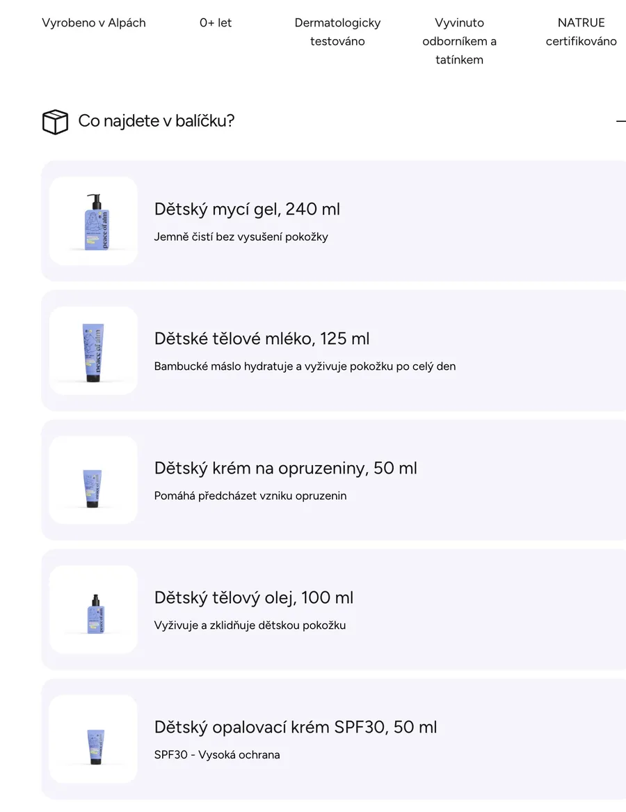
The complete marmot ritual. Opening What’s in the bundle shows five products with their size and a short description, followed by a summary of the bundle and the brand.
Starting point
The brand has a strong visual identity: a periwinkle colour, Almík the marmot mascot and its own typefaces. The base theme needed to reflect the brand’s visual identity and the way its products are presented.
Ingredients, certification and suitability for sensitive skin need to be easy to find when choosing baby skincare. The labels highlight these details directly on the product page.
Project scope
- Theme customisationThe Wonder theme adapted to a store with five products and bundles.
- Matched to the brandColours, mascot illustrations and custom typefaces across the store.
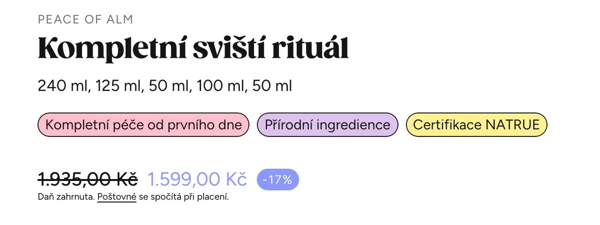
- Property labelsColoured labels on products, for example ingredients or certification.
- Discounted bundlesProduct sets with the original and bundle price and a list of what is inside.
My contribution
- Adapting the theme to the brand’s visual identity.
- Custom typography: main headings in Gazpacho Black, body text in Avenir Next.
- Product property labels, such as “NATRUE certified”, “Natural ingredients” or “Soothing”.
- Discounted bundles: a product made of several items, with the original price, the discount and a list of what it contains.
Labels and bundles up close
The product page combines distinctive property labels with a clear list of the bundle’s contents. Customers can see the product features and included items without searching through a long description.
Mobile version
Phone recordings at 390 px wide, the way most visitors see the site.
Home page Product with labels What’s in the bundle
Store colours and type
- #8A98FFPrimary
- #FFF18FYellow panels
- #C7EAE4Mint panels
- #151515Text and buttons
- Gazpacho BlackHeadings
- Avenir NextBody
Values read from the live site’s styles.
Working on something similar?
Send a short description of where the store is now and what it needs to do. I’ll go through it, ask what is missing and suggest a realistic next step.
I want to adapt my theme ↗︎Related articles
- Shopify Theme vs Custom Redesign: When to UpgradeHow to choose between a ready-made Shopify theme, custom sections and a broader redesign focused on mobile UX, performance and maintainability.→
- How Much Does a Shopify Store Cost in 2026?A practical breakdown of Shopify plan, theme, app, development, testing and ongoing support costs for a new or redesigned store.→
- Shopify Support vs Developer vs AgencyHow to choose between Shopify Support, a theme or app vendor, an independent developer and an agency for store maintenance and fixes.→